Splash of Paint
BRIEF
Splash of Paint began out of necessity for NY real estate agent who was having trouble finding a local painting service to help repaint apartments on the market for sale. What began as a side hustle, quickly turned into a full time business with apartments frequently being bought and sold around NYC.
Nash was hired to execute the core branding assets for Splash of Paint in the form of a clean wordmark, brand colors, illustrations, and apparel.
SCOPE OF WORK
Logo Identity
Color
Illustration
Merchandise
THE CONCEPT
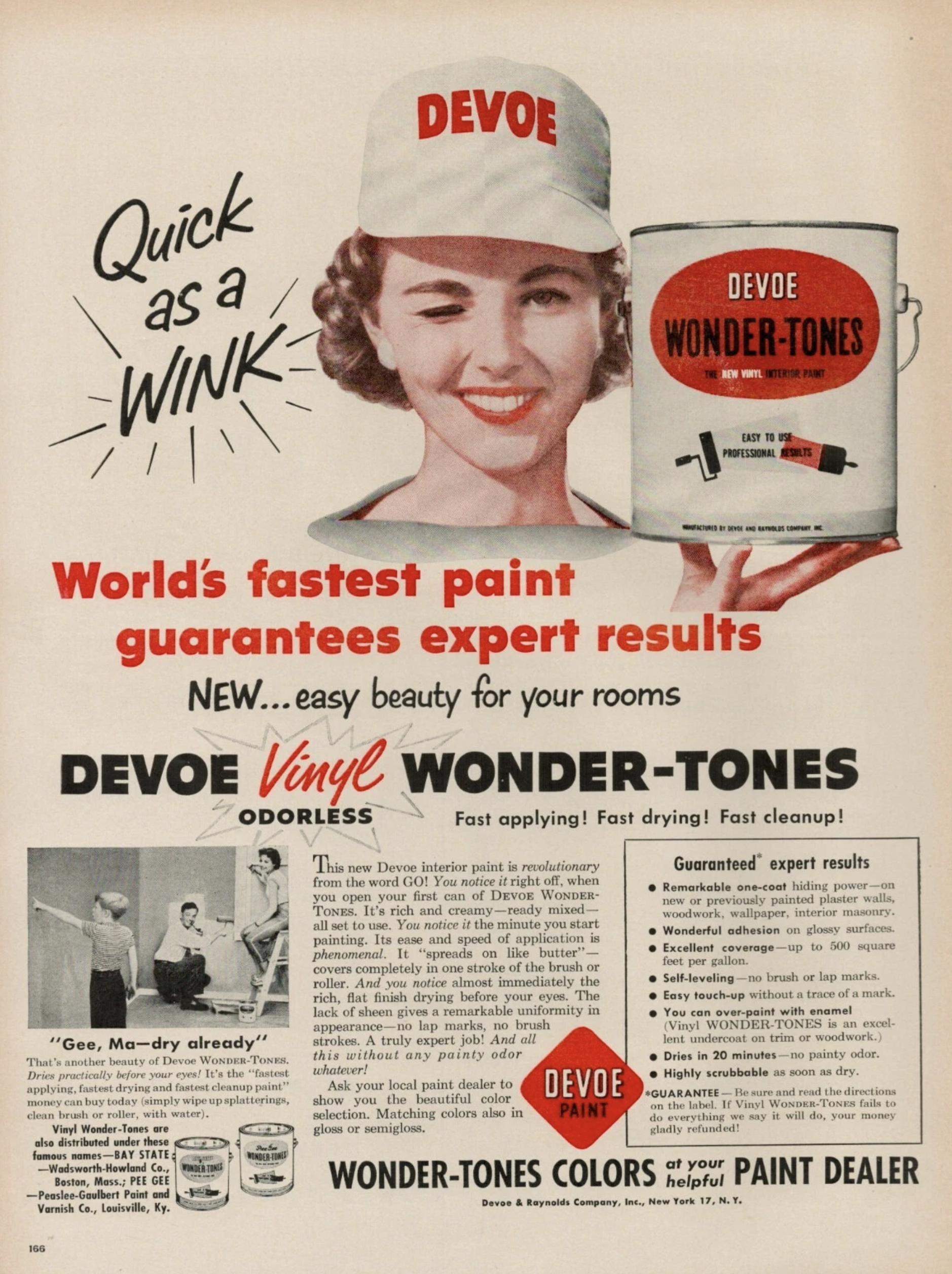
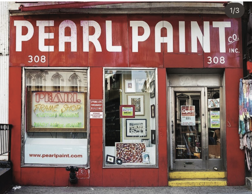
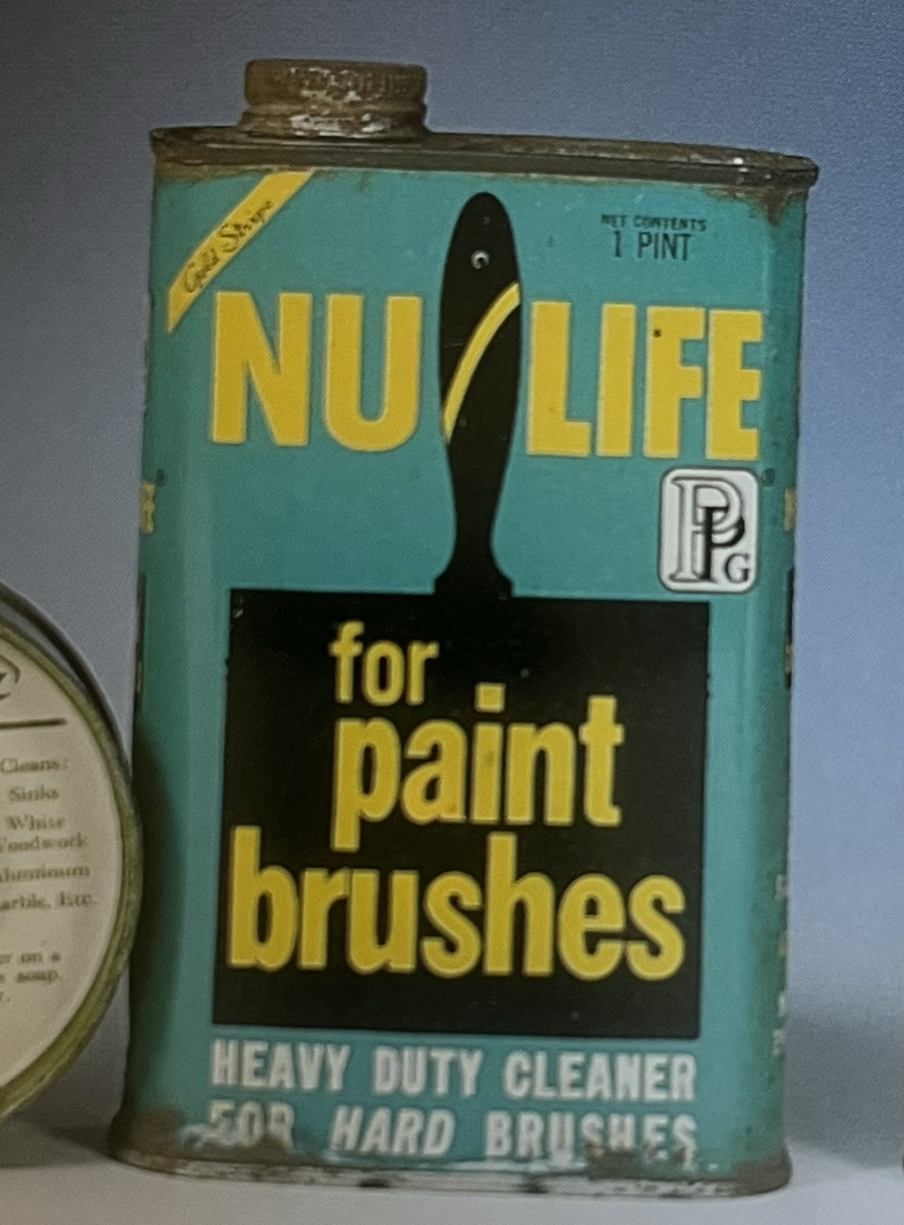
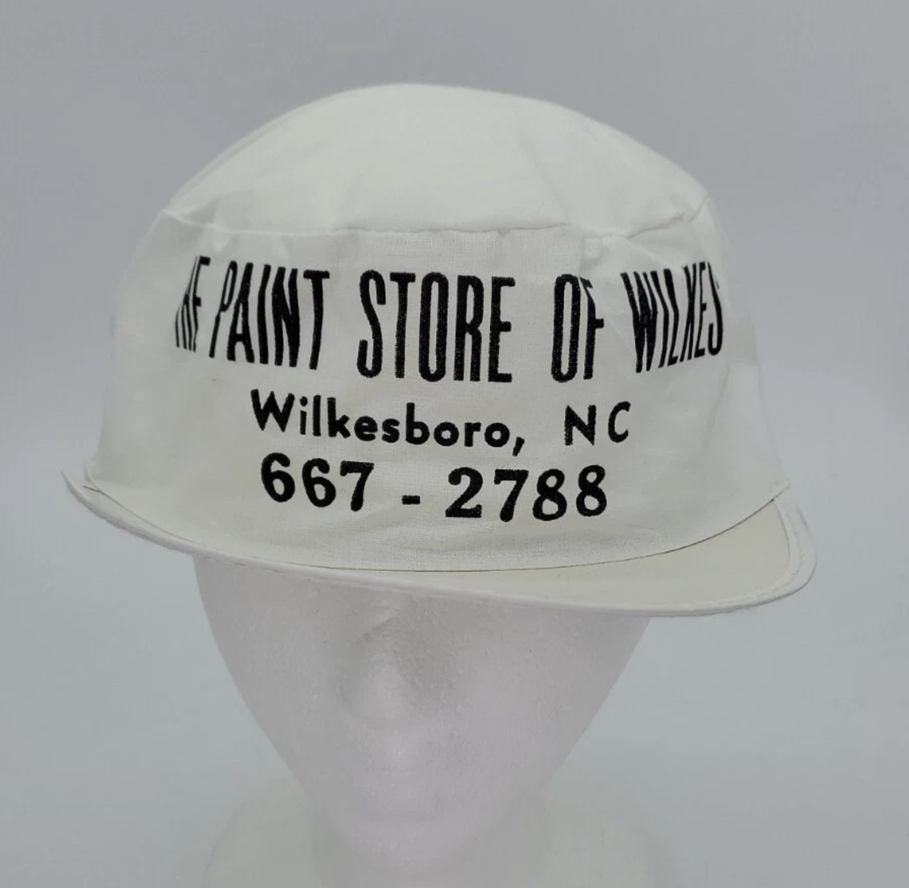
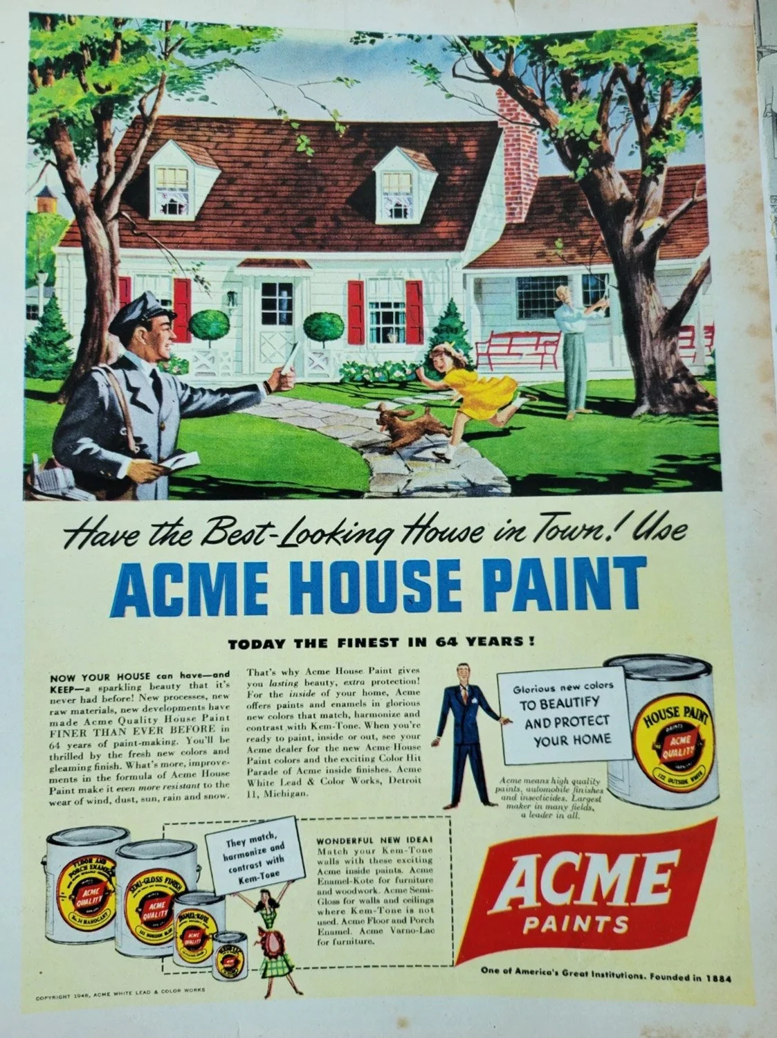
For a designer who loves old typography and signage, working with a paint company was a dream come true. The paint industry has a rich history of remarkable advertising and references from the past 100 years to pull from and be inspired by. Everything from the all white coverall uniforms, to big and bold typography with fun pop colors, the industry is full of great imagery.
We designed a mark that odes to the past but doesn’t feel outdated. The typography is completely custom with a hand drawn script accompanying bold letterforms for a friendly yet powerful appearance. The use of a paint drop shape adds more playfulness to the type heavy mark, and we designed a set of paint bucket illustrations to round out the deliverables.